At Strut, we strongly believe the internet is a right for all. We aren’t going to beam network connectivity into third world countries (we’ll leave that to Elon), but we can help by building websites that can be used by everyone.
It is estimated 22% of Canadians have one or more disabilities. As alarming at that statistic is on a human-level, from a business standpoint, that’s around 1-in-5 people who may not be able to use your website, buy items from your online store, subscribe to your newsletter, or share your content with their friends. Accessibility goes beyond being a good human, it’s good business.
All sites developed by Strut are designed and built with accessibility in mind. Although the internet is for the most part, the “Wild West”, it is still loosely governed by the World Wide Web Consortium (W3C). This consortium includes the Web Accessibility Initiative which publishes the Web Content Accessibility Guidelines (WCAG). The second version of these standards has three high-level “ratings”: A, AA and AAA.
We see “A” as table-stakes, it’s easy to achieve and the absolute bare minimum. “AAA” is a lofty goal. Generalizing, a triple-A rating is something only governments or extremely motivated and well-funded organizations will be able to achieve. We guarantee all our sites, from a design and development standpoint, will achieve a “AA” rating.
Although we are passionate about accessibility, we will also be the first to tell you the WCAG 2 guidelines are anything but simple. They’re long. They’re technical. And they’re not black-and-white. (accessibility pun intended) To help you understand what a double-A rating consists of, we’ve put together a list of the high-level things you should be doing on your site to be a responsible www citizen.
Be intentional
Strut’s development team has a loose set of guiding principles. Some of the first promises in that credo are “Read the documentation”, “We don’t believe in hacking” (quick fixes) and “We debate semantics”. The common theme being, “be intentional”. Internet developers have a number of best practices they can subscribe to in order to be a better developer and have their websites work across all browsers, not just their favourite.
One indispensable resource is the MDN Web Docs open-source documentation built and maintained by Mozilla. This documentation painstakingly outlines the syntax, intentions and expected behaviour of every HTML tag, CSS specification, and Javascript method defined by the W3C and adopted by browsers.
By being syntactically correct, we’re not only making a site more compatible, performant, and maintainable, we’re also building a site that non-mainstream browsers can understand. Screen readers include a web browser that people with certain disabilities use to navigate the internet. These screen readers rely on web developers building a site they can understand. By being intentional in our web development, we’re supporting a web standard we can all rely on.
Not quite sure what a screen reader is? Here’s a fantastic video of a woman who is visually impaired demonstrating how she uses an iPhone.
Use alt text, captions, and ARIA
Alternative text should be added to all non-text content, though images are the most common element to focus on. Alt text isn’t a caption. A caption (which is also a good practice) is something for all users and provides secondary context to an image. Alt text is for users who cannot see or load a graphic and provides a text description of what an image presents.
Here’s an example:
Caption: Plains bison, Banff National Park, Alberta, Canada. Photo: Peter Smith, 2022
Alt text: Herd of about a dozen bison graze an alpine meadow with snow-capped mountains in the background

<figure>
<img src="bison.jpg" alt="Herd of about a dozen bison graze an open prairie with snow-capped mountains in the background" width="900" height="600" loading="lazy" />
<ficaption>American Bison, Rainier Alberta, Canada. Photo: Peter Smith, 2022</figcaption>
</figure>
Sounds simple, doesn’t it? You might be surprised to learn, writing good alternative text is a skill. Check out this guide from Harvard to get some tips on how to master alt text.
It doesn’t make sense for some elements to have CMS-driven content added to them. Never fear, developers can use ARIA attributes to have your back… ARIA, or Accessible Rich Internet Applications, is a set of W3C accessibility standards to fill gaps in HTML and help facilitate interactions and widgets/web applications on screen readers and other accessibility technologies. It assigns roles and descriptions to user interface elements (e.g., buttons and form fields) so people using those technologies know what the expected action is and receive appropriate feedback after taking that action.
Fail gracefully
 This concept commonly applies to contemporary websites on older browsers (cough-Internet Explorer-cough) but is simply the process of making sure a website “fails successfully”. This reasoning goes well beyond the scope of accessibility so feel free to buy me a beer and I’ll reminisce about the techniques we’ve employed over the years to build beautifully modern websites that also work on IE7.
One technique Strut has been using for a couple years is the CSS media prefers-reduced-motion feature. If we are developing something we think may be a photosensitive trigger, we gracefully degrade the styling back to something with limited and safer motion. For more information on this modern browser feature, “read the documentation” and Mozilla has an in-depth article on “doing no harm” when developing a website with features that could cause seizures.
Honour thy keyboard
A website should be built to accept three types of input: mouse, keyboard, and touch. Touch is, 99% of the time, easy because your mobile phone and browser do the all the hard work for us. Mouse is even easier, it’s pretty native. Keyboards however have traditionally been given the cold shoulder by web developers. I can’t blame an able-bodied Gen-Z’er for not understanding that a computer (and thus website) should be completely navigable by your keyboard but it’s an education that needs to happen.
An accessible website needs to accept all three control methods. That means ensuring focus states for every interactive element on the site is a must. Try “tabbing” through Strut’s website to see how the site is easy to use with only your keyboard. The browser will follow all control elements (e.g., buttons, links, etc) in the order they appear in the structure of the page’s document.
Roses are brown, violets are grey
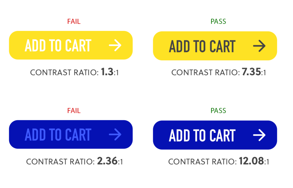
Silly jokes aside, colour contrast is one of the most important factors when designing a modern website. Hired a copyrighter? Fantastic! Honed your calls-to-action (CTAs) to be as effective as possible? Amazing! Styled your buttons for conversion with white text on a yellow background? Bummer.
Colour contrast is measured as a ratio of contrast between foreground elements (e.g., text) and background elements (e.g., coloured backgrounds, images). Keep camouflage to your closet, not on your website.
To achieve a “AA” rating for accessibility, all your small text (i.e., paragraph content) needs to have at least a 4.5:1 ratio and large text, such as headers, a 3:1 ratio. Most design applications will have plugins that will easily measure this ratio for you. Strut’s team uses the plugins for Figma and Photoshop as well as WebAIM’s online tool.
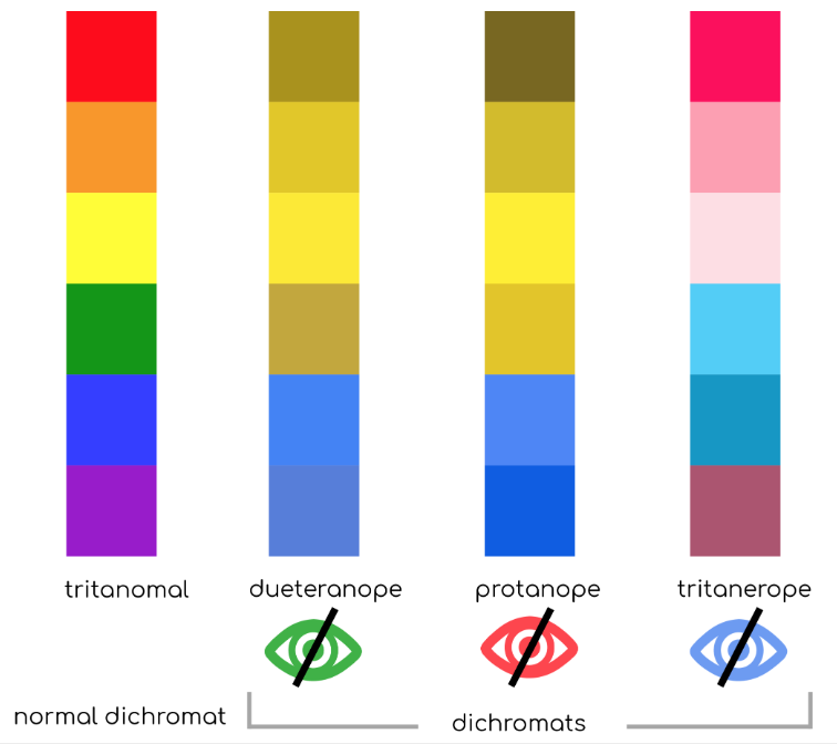
In addition to colour contrast for true colours, it’s always good practice to view your design as a colour-blind individual as well. Read more on colour blindness and user interface design in this article from the UX Collective.
Another golden rule for user experience – disabled or not – is to never use only colour to convey meaning. For example: when a user submits a form, instead of simply turning the label red on an empty required input field, add an actual error message next to the input to also delineate which field is causing the validation error. I could write an entire article about this topic alone but this article by UX Magazine will get across the point.
One nit that I have is the false belief that colour contrast is only applicable to digital communications. Many print designers have designed billboards, posters, and ads without considering colour contrast and wondered why their work hasn’t garnered the response they expected. No matter the medium, it helps if your work “pops” and doesn’t require “work” to read your message.
Size matters
With similar reasoning to colour contrast, text size is really important. Design your site to have text that is at least 16px for body copy. That is obviously a relative size as 16px in one font is not the same as 16px in another, but it’s a good starting point.
If you look through a number of popular news sites you will notice their article text is generally around 20px, a size once reserved for high school students trying to pad their page count. Why? People don’t sit down and read your content, they scan it. If your users only want to skim your content then you better make it easy to do so – larger fonts with shorter line lengths will boost your chances of content engagement.
My points above talk to all users, but it’s rational to believe that if able-bodied users want larger text, shorter line lengths, darker font colours, and a more structured document, then visually impaired users are going to benefit even more from it.
Explain it like I’m 5
I’m not talking about the popular subreddit, I’m telling all copywriters and content developers to dumb.it.down. To achieve a complete AA WCAG accessibility rating, besides following accessibility standards for web design and dev, all content needs to be easily understood by a person with a grade 10 education.
You may want to convey your organization’s deep understanding of a topic, detail a highly technical subject, or simply show off your smarts, but it’s only going to dissuade a proportion of your user base from engaging with your content. Construct your content to use easily understood words, avoid acronyms and industry jargon without definitions (or other techniques to convey meaning such as a tooltip or glossary), and guide your users through the content as though it’s their first time discovering the topic. This can be a tricky endeavour when speaking as the expert, but your user satisfaction and overall website usability will benefit.
You can measure text content against the the Flesch-Kincaid Grade Level test using one of many online tools, or the Document Stats feature built into Microsoft Word.
This accessibility-centred thinking dovetails into techniques commonly employed to increase Search Engine Optimization (SEO) rankings, boost lead conversions, and improve content engagement and overall user experience.
A trend I welcome, is a push away from the old “Learn more” or “See more” buttons or CTAs to more discernible and descriptive language. “Read the Glenbow Website Case Study” is a much better grab than “Read the Case Study” which relies on related content to provide context to the desired user action. This also allows screen readers to provide context to the link and allow a disabled user to more easily navigate your site.
If it’s not a pattern, it’s an anti-pattern

Once again, a topic that deserves to be its own blog post – creating a seamless and intuitive user experience (UX).
Billions of dollars – that’s with a B – have been spent honing user experience, so I’m not going to rehash it in this article, but what we can quickly cover is how good UX isn’t mutually exclusive from good accessibility.
What’s an anti-pattern? In simple terms related to this topic, it’s an artificial barrier created by a web designer or developer. One that goes against the intuitive or pre-learned user behaviours and will confuse or prevent a user from using the site easily.
Simple examples of anti-patterns would be using the “hamburger” icon for anything other than navigation or making checkboxes and radio form fields look the same – you’re going against a design system that the user already knows.
By following learned behaviours taught to users since the birth of the internet (or at least following mainstream trends) you are making your site easier to use and thus, more accessible. This can be a hard pill to swallow for a designer who wants to push boundaries or create something that “looks better” than the norm, but it begs the question, what’s the point of a stunning website that is impossible to use?
Websites are a tool and thus should apply equal emphasis on function as it does the aesthetics. Just like a tradesman will buy a Milwaukee tool for its superior quality rather than just because it’s red. Web designers are constantly challenged with finding equilibrium between upholding a brand’s image, a beautiful UI and a seamless user experience that guides (and keeps) users engaging with the website and it’s content.
What is the point of a stunning website that is impossible to use?
Benchmark first, celebrate later
The more I write, the more I realize I have merely scratched the surface on this complicated subject. Instead of writing a Tolkien-worthy tome, I’m going to encourage you to dive in and see how your site is performing!
There are many free online accessibility assessment tools that will give you an initial score to know how well your site is performing, but true to the complexity of this topic, benchmarking accessibility is also not an exact science. It’s subjective. It’s conditional. And it differs user-to-user. For this reason, I recommend contacting Strut to audit your site and provide a list of recommendations to improve your site’s performance in this field.
Let’s work together to contribute to an internet for all, then celebrate!