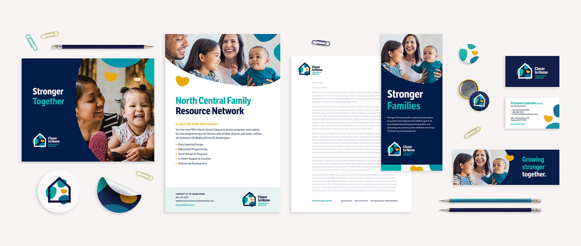
After more than 25 years serving families in Calgary and area, Closer to Home Community Services was looking to update its brand and marketing communications to better reflect who the organization is today and better connect with the families it serves.
This meant auditing the existing brand, undertaking a detailed discovery process, and crafting a refined brand identity that clearly communicates what makes Closer to Home stand out from other family services organizations.

About Closer to Home
Closer to Home is a non-profit organization which strives to preserve, reunify and build stronger families who can care for their children and contribute meaningfully in their community.
Their family-centred, strength-based services ensure that children have stable, healthy and safe living environments in which to grow and develop. And in some cases, when families are separated, Closer to Home provides a place for children and youth to call home while offering therapeutic support with the ultimate goal of family reunification.
Brand Strategy & Messaging Platform
We began by hosting a virtual stakeholder discovery session and conducting in-depth sector and competitor research. Next, we distilled key insights to inform Closer to Home’s updated brand position and brand promise. From there, we crafted the brand strategy, brand narrative and key messages to position the organization as a leader among its peers and enable employees to speak in a cohesive and accessible voice.
Visual Identity
Next, we developed a new visual identity leveraging Closer to Home’s existing brand equity through use of shape and colour, while modernizing the visual approach with an updated secondary palette, juxtaposition of clean lines with organic shapes, and a more youthful aesthetic. The goal? Create a refined visual identity that encompasses who the organization is today and where it hopes to grow in the years to come as it moves into its new building (currently in capital campaign) and beyond.
Growing stronger together.

Each individual component forming the new Closer to Home logo represents a value attributed to the brand. The house represents strength, protection and support. The organic forms, called Kin, represent family, children, and community connections. And the heart represents hope, healing and love.

Website
The goals for the new Closer to Home website were simple: increase donations, increase program registrations, and increase awareness and applications among prospective foster parents. The website was also an opportunity to enhance brand visibility and create an online experience as accessible as Closer to Home’s in-person programs.
The old website used an outdated navigation system and confusing information architecture that made it difficult for visitors to find the information they were looking for, particularly in the area of programs. The new website makes finding programs and services simple. Visitors can browse Closer to Home’s offerings in multiple ways. Site visitors can explore programs using faceted search filters and tiled tags on the Programs page as well as peruse the Calendar, which shows all activities occurring in any given week.
Built to be versatile for both Closer to Home staff and the end user, the website makes program registration simple, integrating online forms and employing automated emails to help increase efficiencies and cut down on staff administration time. The site also integrates with Closer to Home’s Bamboo HR software so that new job openings are automatically posted on the Careers page, and uses Blackbaud eTapestry integrations to simplify donation processing and tax receipting.

