Strut partnered with Calgary Foothills Primary Care Network to revitalize their website, delivering a modern user experience for those seeking healthcare providers in Calgary’s Northwest communities. It’s just what the doctor ordered.
The brief
Calgary Foothills Primary Care Network (CFPCN) services northwest Calgary and Cochrane in Alberta; a group of more than 500 family doctors and health professionals striving to offer patients the best in primary healthcare. CFPCN asked Strut to design a website that matched their level of quality care and to make finding the healthcare support people need, easy and accessible.
The solution
Search by health topic
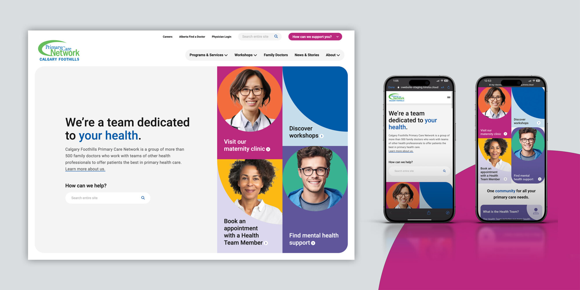
Website users are presented with a number of paths to the information they are looking for. Together with the client, Strut determined that the most common way users interact with the website is to search for resources and practitioners directly related to their health concerns.
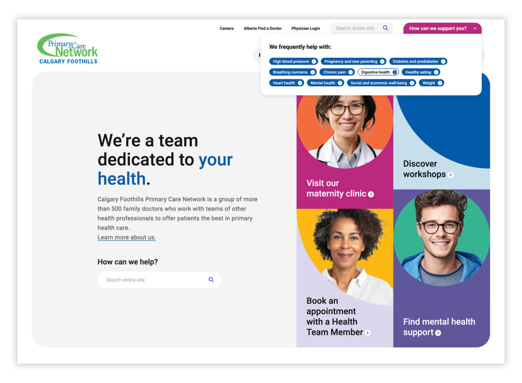
To accommodate this, Strut built a global search filter that is easily accessible through the utility navigation and a first impression banner featuring a call to action and keyword search field. When users search a health topic, the site returns all related articles and resources.
Family doctor directory
To ensure users can easily connect with a family doctor or clinic in their catchment area, Strut developed a directory with common filter options, such as physician gender, language preference, and whether a clinic or physician is accepting new patients. Users can search using either a map or a list view.
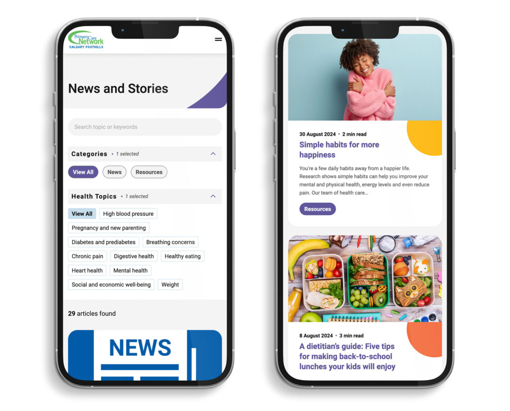
Current news and resources
To offer users additional relevant information, Strut designed a user-friendly news page where healthcare-related articles and resources can be easily browsed. The page allows users to filter articles by health topic, helping them find the information they need more quickly.
Refreshed design
The CFPCN website, over seven years old, was ready for a visual refresh. The previous design relied heavily on illustrations that felt somewhat childish and dated for the primary audience. While the existing colour palette was bright and energetic, Strut chose to reimagine how colour was applied rather than introduce a new scheme. Bold, saturated swatches were balanced with tints of the primary colours to create a more refined design. Although the old illustrations needed an update, their graphic nature had become part of CFPCN’s identity. To maintain this element, Strut replaced the cartoon-like illustrations with graphic shapes and iconography. The use of solid colours and shapes, paired with images representing both target demographics and healthcare professionals, resulted in a friendly, approachable design that encourages site exploration.
Award recognitions
The website was awarded a Gold dotCOMM by the Association of Marketing and Communication Professionals in the United States in the category Redesign. The new CFPCN website also received a 2024 Silver Leaf Award, being recognized for excellence in strategic communication, innovation, and creativity.
Strut really listened and embraced our goal for the project: to build a site that is focused on our patients.
— Taryn Albizzati, Communications Specialist
“Thank you to the entire team at Strut for a smooth and successful site launch! We know the team went over and above to ensure every detail was considered. They really listened and embraced our goal for the project: to build a site that is focused on our patients. We are so excited to share this with our community knowing it will make a difference to our team and users alike.”
